
Friday, 14 December 2012
Friday, 7 December 2012
Box Design

I started this by adding in the text I wanted on the box, along with the logo. However, I felt that it needed to be more eye-catching, so I decided on the same design that I did for the back of the playing card.

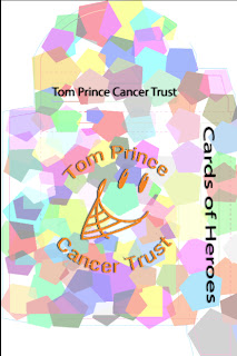
Once I had finished, the logo looked like it didn't stand out, so I put a white box over the the whole design, and then I changed to opacity of the white box so the rest of the design came through. By doing this, the shapes were a softer colour, so the logo can be seen more effectively.

We then had to add text about the project to let the public know about the project.

Here is the final design.
Subscribe to:
Comments (Atom)