
Friday, 14 December 2012
Friday, 7 December 2012
Box Design

I started this by adding in the text I wanted on the box, along with the logo. However, I felt that it needed to be more eye-catching, so I decided on the same design that I did for the back of the playing card.
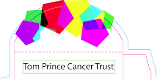

Once I had finished, the logo looked like it didn't stand out, so I put a white box over the the whole design, and then I changed to opacity of the white box so the rest of the design came through. By doing this, the shapes were a softer colour, so the logo can be seen more effectively.

We then had to add text about the project to let the public know about the project.

Here is the final design.
Friday, 23 November 2012
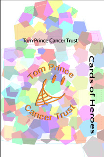
Back of Playing Card

For my playing card back, I decided to colour shapes in the style of Jamie Reid's work. I started with circles but I thought it didn't work, so I started again with polygons. To achieve this, I made the polygons different colours, then overlapped parts and corners of the shapes, and then made the overlapping different to achieve different effects.

By doing this, different parts of the shapes turned different colours. For example, on the above, there is a dark purple polygon which is half blue.

This is to show how to change to effects. Highlighted on the above picture is 'polygon 2' and in the drop down bar above, it says 'difference', which produces a different effect.


On this one, 'polygon 35' worked best with 'darker colour', and this made it darker, which made the ones it overlapped have a darker colour when it was a light shape where it wasn't overlapped.

I captured this corner of my design because I thought the colours overlapping in this section were strong. I also liked the colours used and how it looks overlapped.

To finish, I added the Tom Prince Cancer Trust logo.
Friday, 9 November 2012
Playing Card

I started this workshop by deciding my hero. I chose J.K Rowling because she is my favourite author and she has inspired me to write my own story, especially because of how she grew up and how her life has turned out compared to how it was. I then decided on doing my work in the style of Tim Marrs, where it is symmetrical. I then chose to do the Horcruxes as my theme, though I have only used six because the seventh didn't fit in with the design. I placed these around J.K Rowling's picture.

Following Tim Marr's work, I added a threshold and another to make the images black and white before adding an overlay of colour, then I blended the two layers together for the colour to be showing the black and white layer through.

I then added in text that is to do with her books. She is most famous for her Harry Potter series so I chose the words: 'Gryffindor', 'Hufflepuff', 'Ravenclaw', 'Slytherin', 'Welcome to Hogwarts', 'J.K Rowling' and 'Neither can live while the other survives'. For the four Hogwarts houses, I used the colour that represents them in the books, red for Gryffindor, yellow for Hufflepuff, blue for Ravenclaw and green for Slytherin.

To make my card complete, I decided to copy and paste the images and then flip then both vertically and horizontally.

I then experimented with different gradients to add for a background. However, I felt that it didn't make my work stand out as much so I decided to keep it black and white.

I then put a black box around the quote 'neither can live while others survive'. I made the text white and added the club symbol in the middle around this. This is the finished product.
Friday, 19 October 2012
Jamie Ried work

The one above was for 'Government'

This is the 'Before' for greed.

This is the after.
19/10/2012- Statement of Intent
For my playing card, I chose the seven of clubs. I have decided to produce my card with J.K Rowling as my hero. My design will use a Tim Marrs design. I will use the fact that there is seven books and seven horcruxes to show a theme of the number seven.
Thursday, 4 October 2012

Friday, 28 September 2012


Friday, 21 September 2012

Friday, 14 September 2012
Double Page spread work
I started this work with going onto illustrator and changing the orientation to landscape. I then made my guides for each page and then for my columns of writing. I filled these with text from www.loripsum.net.
For my images, I decided to use a black background on illustrator so I had to change the background on all my other images. Here's an example:


Subscribe to:
Comments (Atom)