Thursday, 23 May 2013

FMP Evaluation


What are the strengths of your self-portrait models?

I’d say that the strengths of my self-portrait models are the little bits of detail. Though they looked good before, they are a bit more distinguishable as me. For example, my lips are quite dry and are sometimes crack, so I added little lines onto them. I also added freckles, and then a blush, which I changed the opacity to make some of the freckles show through. I’d also say that the detail on my Harry Potter Meg. Though they were imported from Google, they do make good detail.

Why are your self-portrait models suitable for the industry?

The self-portrait models are suitable for the industry, mainly because it is a different idea. It would also show a potential employer how you see yourself, and a bit about your interests. For example, from my alter ego, it would show an employer that I like Harry Potter, and that I have a good imagination, as I have managed to make o obvious who the alter ego is, but it also has features of me, for example, my face.

What are possible weaknesses of your self-portrait models?

I suppose possible weaknesses could be that there isn’t much detail in the hair. After making the modes, I realised that it would look a bit more detailed if there were thin lines in the hair, such as the parting to show more detail.
Another potential weakness is that sometimes they are a bit wobbly, and it takes a minute to stand them up.

If you were to do this again, what changes would you make and why?

If I were to make the models again, I would add a bit more detail to the hair on my model. I would also change my outfit on the model, as it looks a little childish (in m opinion). However, I wouldn’t change much about the alter-ego, apart from some more details to the hair.

FMP


For the self-portrait models, I started my drawing myself six times. This had me with straight hair, curly hair, and even ‘angry’ at my job. I then coloured my body to represent what I would usually wear: jeans and a variety of tops.
I then added my alter egos. For these, I made myself into Harry Potter, because I love the books, me as an owl, because they are my favourite animal, me as ‘Super Meg’, me as a rabbit, me as a book, because I love reading, me as the devil and me as ‘Little Meg Riding Hood’.
I then chose to make the Harry Potter one and me with straight hair. For the original one of me, I used the paintbrush to create the outline for the eyes, eyebrows, nose and mouth. I then added little details, such as eyelashes, freckles, pink cheeks, and lines in my mouth and owl earrings. I got the owl earrings from Google, and then imported them, however, I decided to find some earrings that I actually own, and wear all the time.
The body looked bare after I had coloured it, so I decided to draw an owl onto the top. I then added a drop shadow so it stood out a bit more. I also added clips into the front of my hair, which is to represent my fringe being pulled back, which is a style I wear my hair in sometimes.
I used the same design for my Harry Potter ‘me’. However, I didn’t make hair around my face, but made a fringe similar to what Harry Potter had in the first movies.
I then made the body black, but added red around the wrists and found a Gryffindor tie and crest from Google. I felt that this would make it more authentic, and I had found it difficult to draw, both in hand and on Photoshop.


Thursday, 28 March 2013

Graphic Narrative Evaluation

What do you think of the overall narrative assignment?
I think that the overall narrative was a very good idea. I liked how the whole project was based on water, mainly the sea. This is a good idea because it gave a wide range of poems to choose from, and all had really good imagery to help make graphic narratives.

Are you happy with the material you chose?
I chose the poem 'Island Man' because I remembered the poem from school, and knew what the poem was about. However, I nearly chose 'Blessing', again because I have studied this. To choose the poem I would do, I did two storyboards, one for each. After this, I found that I had more ideas for Island Man.
The decided to draw out my storyboard on A4 paper and then scan in to colour in Photoshop. I thought that this would work because I would be able to manipulate the drawings more than I would if I had made the whole thing using Photoshop. This is because I felt that I would struggle trying to make it all in Photoshop, however, I would get better colour using Photoshop. I then added text and backgrounds in Photoshop.
I am happy with doing this in the way I did because I feel that I got strong results.

Would you make adjustments next time?
Personally, I wouldn't have put the text in boxes in the corner. This is because I had to make the text in Illustrator after, and it was harder to make the lines meet up. For example, on Frame 2 and 3, there is the sun, and it was hard to follow it around to make it look like it flowed.
I would also go over the drawing with a dark black pen over the pencil. This is because it was hard and took a long time going over all of the black lines.

Are the techniques you used to make your solution adequate or would you use a different range of production techniques?
My narrative looks exactly how I wanted it to look. This is because I drew the frames, so it would look how I want it to look. However, I wish I was more skilled in drawing. When frames 4 and 6 were done, I felt that they didn't look complete, so I added in the background, the sky, grass and water to make it look more detailed.

What are the views of other people regarding your narrative?
I initially showed my lecturer when the first coloured designs. The designs were discussed and it was decided to add more detail, such as the shadows and a fish into frame two.
I then showed the finished designs to some members of the class. They said that they found the designs bright, colourful and well detailed.

Does the narrative work?
I think that the narrative does work. This is because it follows the poem and you can see the change between the Island and London, and it reflects his thoughts: the Island being 'beautiful' and bright,
whereas London is dark and grey and 'boring' to him, even the seagulls are different colours!
I think the writing stands out and it works on its own, as well as in the image.

Final Designs finished

When I scanned my work into Photoshop, I had to redo the outlines. To do this, I started by adjusting the threshold, however, this didn't work as well as I had hoped, so I used a paintbrush to make the lines bolder. I then used the paint bucket and paint brush to colour in the drawings. When this was finished, I focused on the font of the writing.
Originally for this, I had just out a normal font in a box at the top, but it didn't look very effective. This is when I went into Illustrator and focused on making the text stand out.
After this, I felt that frames 4 and 6 weren't as effective as the rest. This was because the drawings were central to the page, whereas the rest of the frames all had backgrounds. So, I added in lines in the shapes of buildings and coloured grey. I then added in grass, and water on the last frame, and just grass in the 4th frame.
To finish off, I added in shadows to the people, the fish, the trees and the ball to add more detail. To do this, I used to 'polygonal lasso' tool to create where the shadow would go. Then I used the gradient tool to colour it in. On the fish, this didn't look great, so I then added a blur on this, to go with the effect of the fish.

Here are the finished designs:


Friday, 15 February 2013

Final drafts for Island Man

This is the first frame of the poem. Through the window, there will be blues and yellows to represent a sunny day. The room will be neutral, with bright colours on the poster (the fish) and the duvet. He will be in colour as well, as this will represent how he would be if he were on his island. 
The second frame will be in blues, yellows and other bright colours, as will the third frame. This is because his island is supposed to be visually appealing, and it has to be 'desirable', as this is the place he would rather be.


Frame 4 will be of the 'North Circular soar', which is London. It is shown through traffic. Most of this frame will be grey, with hints of colour on the cars, which will be faded down to show the 'blandness' he feels when he is in London.

 Frame 5 is the same as frame one, however, different because out of the window, it will be different shades of grey, to represent London. His clothing will also be a different colour, to show he is in a suit because of work.
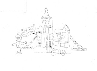
 Frame 6 is 'Another London Day', which is represented by London monuments. It will (hopefully) be in similar colours to what the actual monuments are, however, will be faded down similarly to frame 4.

Thursday, 14 February 2013

Drafts

Here are some of the draft work for my poems. 


Above is the first initial design for my poem. I used the storyboard designs to do rough drawing, including stick people so I could get an ideas of how I would like my poem to look. 
Here are some of my drawings for island man. I have decided on a cartoon theme throughout the poem. I have used different ones for the traffic scene to show a dramatic difference between the Island people and London, as it is two completely different aspects of his life. 

The difference between London and the Island will also be shown through the use of colour. London will be quite dull with the uses of grey, but the island will have lots of different colours to show the brightness.

Thursday, 31 January 2013

Sketch for poems

For this task, I didn't know which poem to choose between: Blessing and Island Man. I decided on these two at the beginning because they are two very good poems with some good imagery.

So I decided to do some very rough drawings to start with and see which one worked better for me:


After sketching them out, I decided on Island Man. This is because ideas came more easily when thinking of what to draw. I also have ideas on how to colour it in. Though blessing was good, it was hard how to present it, and then only frame I had no difficulty drawing was frame four, where they congregate to the water pump.

Thursday, 24 January 2013

Jack and Jill Workshop

I really think my storyboard works for showing off Jack and Jill because of the symbols I have used.
For Jack and Jill, I have kept it simple, to a symbol of a boy and a symbol of a girl. This is because it is easy to distinguish who is who, whereas I feel that if I had used animals, it would be easy to forget which animal represented who. In the first frame, I have cut out a shape to be the sun to symbolise that the beginning is happy. I am going to add bright colours, such as blue for the sky, green for the grass etc...
For the second frame, Jack and Jill are climbing a hill. For this, I have enlarged some snakes and cut them in half and stuck them next to each other to show a hill shape. I have then used arrows pointing up. I think it works because it does look like they are climbing up a hill.
For the third frame, I have used a fire hydrant and some shapes to make a bucket. I then found a symbol and had it copied to make a wave effect. This will work for water in the bucket because it will look like proper water when it is coloured in different shades of blue.
The fourth frame shows Jack falling down the hill. This frame works because it has the same design as the second frame, so it shows consistency and people would know that is the hill.
For the fifth frame, I have cut a crown in half so it looks broken. To show a change of emotion from the first frame, I have used exclamation marks and the '@' sign, because when making 'smileys' on the computer, the '@' sign is used to make an angry face.
I think my storyboard works because it is consistent and the same symbols are used for each part, so nothing looks out of place.


Thursday, 17 January 2013

5 inspiring artists.

1. William Shakespeare- A Midsummers Night Dream Manga. Illustrated by Kate Brown


 These are some examples of the illustration in this book.  It looks like it was hand-drawn, and then added to the computer where the colour and text was added to it. 
I like how it switches between black and white to colour. I also like how the text is done in speech bubbles. The colours on the coloured pages the colours go together very well and it isn't 'in your face' and too bright. This could influence my narrative because I could use the fact that the colours aren't too bright, as this would make it look more realistic. I could also use the way I think this was designed: I could draw my narrative and then scan it to the computer to add colour and text.

2. Emma Dibben


This is some of Emma Dibben's work that I liked. It's hand drawn and very realistic. I really like the fishes because I think it is well drawn and it looks like the animals it is meant to be. I also like in the nettle drawing how she hasn't coloured to drawing in, but has done the actual drawing just in the colour it is supposed to be (e.g. nettles are green but instead of colouring around the detail, it is drawn in that colour). This is what would influence my designs, as it would add colour to my designs, but not too overdone. Again, I would scan my drawings into the computer and add text afterwards.

3. Nishant Choksi


After looking on www.centralillustration.com, I found that I really liked Nishant Choksi's work. He specialises in character illustration and has worked with the Guardian and Vodaphone. This is because they are very abstract and different. I picked my two favourites (above). These are my favourite because they made me laugh. I think that these were, again, hand drawn and then tweaked on the computer. These could influence my designs because, if I really thought about how to do it, I could make mine different by using an abstract design.

4. Clare Melinsky


These are some of Clare Melinsky's works. She specialises in lino work, but has done some well known work, such as front covers for the Shakespeare novels and the Harry Potter novels (above). I reckon that these were hand drawn and maybe even coloured. 
 I chose these two pieces of work because I love those designs for the Harry Potter series (and I love the books!) but the second piece because I love the amount of detail she has gone into and I really like how it is shaded in lines in the water. I really think it sets the scene. Again, the colours work well together as well and they don't overpower each other. This could influence the way I design because the sea looks good in this design, so I could try to replicate this in mine.

5. John Holcroft


John Holcroft is an illustrator. His work looks hand drawn and then coloured on the computer after being scanned in. I love his work because it has meaning in them. For example, the top one is basically saying that over time, a house costs a lot of money, and the second one is along the lines of 'you are what you eat'. I love that he has taken sayings and made them visual. My work could be influenced with this because it is literal, and the detail in really well thought out and interesting. For example, you can see individual notes of money floating down.